Symmetri has joined Yes&.
We have some exciting news. Symmetri has decided to join the Yes& team to discover more possibilities to our clients.

We have some exciting news. Symmetri has decided to join the Yes& team to discover more possibilities to our clients.
 Posted by Shane Sevo on April 27, 2015
By now you have probably seen the news on the latest “geddon” to strike technology. The changes starting on April 21st to Google’s ranking algorithm have already been given the moniker by some, “Mobilegeddon”.
Why is it that every time something changes in technology an apocalyptic response is warranted?
To be fair, Google is not just another layer of technology in our lives. For many businesses; Google is the only provider of traffic, leads, and customers that matter. When Google changes the way they rank search results, every online business should pay attention.
We will be expanding our use of mobile-friendliness as a ranking signal. This change will affect mobile searches in all languages worldwide and will have a significant impact in our search results,
The impact of alterations to Google’s search algorithm on businesses are well documented. In 2011 the Google update codenamed “Panda” was focused on removing low quality link farm websites from search results. This was a good thing. Practically overnight, websites that had been created with gray or black-hat tactics were identified and culled from the search results. Websites that were on page one on Monday, all but disappeared on Tuesday.
In 2012 Google initiated another important update to their search algorithm, this time code named “Penguin”. Penguin took a significant bite out of the traffic afforded by black-hat seo tactics and helped many responsible content creators get found by the right audience online. It not only penalized some, but it rewarded others. If you were producing quality content, Penguin wanted to award you with visitor traffic for your keywords.
Over the past few years, these changes continue to roll out every few months as Google gets a better handle on how to connect search terms with the best destination sites.
So what is different this time around? If you have been writing good content on a regular basis within your industry or online niche, should you have anything to worry about?
The big difference this time is in the “Mobile” of Mobilegeddon. Google has a well documented domination of online desktop search at near 70% with the remainder going to Bing and Yahoo. In the realm of mobile search, people searching from their mobile phone or tablet; the numbers reveal an even greater preference for Google, some estimates are greater than 80%.
In 2014, the amount of time spent on mobile devices versus desktops finally tipped the scales for mobile. People spend 60% of their digital screen time with mobile devices and only 40% with desktop screens.
Think about it, when you are anywhere; home, office, store, sporting event, bar, bathroom… yes, even right in front of your desk… you still have your phone with you. When you have a question, searching on your phone is almost always the first option, and chances are that Google is that default option.
Google is the dominant search platform for desktop and mobile, with mobile becoming more and more the priority.
Google’s April 21st change to their search algorithm is now programmed to favor search results that are prepared for mobile display when searched on a mobile device. If your website does not have a mobile version ready to serve up for a particular search result, you could drop below those that do. Mobile-friendliness is now counted as a ranking signal when Google is deciding who gets that coveted top spot on the first page.
This means that you could rank on page one for a search term when someone searches on their laptop or desktop computer, but fall off the grid when the same search is performed on a mobile phone or tablet.
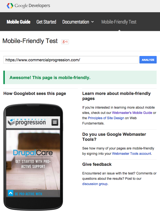
How do you know if your website, pages, and content are in jeopardy of being penalized by this new mobile mandate? Google has done some work to help the universe prepare for their changes. In fact, they have created an entire website to inform developers and webmasters.
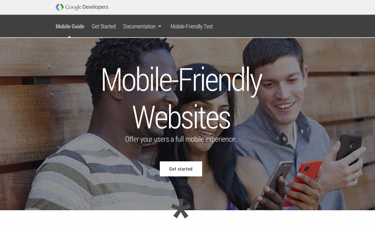
This website has plenty of in-depth information for technical readers, but it also has an extremely handy and simple test that gets right to the point. Just copy and paste your website URL into the mobile test field on this page, hit analyze and wait a few seconds for the results.
A less thorough test, but perhaps just as meaningful is to load up any website on your phone. If the site reformats to your screen with either a mobile version or a responsive design, then it is probably good. If the site is a miniature duplicate of the desktop version that forces you to pinch and pan to see everything, then it has most likely failed the test.
If this still sounds fuzzy and you want more information straight from the source, consider watching the following video as part of Google’s Mobile Madness campaign supporting the release of the new algorithm changes.
Google is still trying to keep to their motto of “don’t be evil”. In this case, Google considers it evil to force people to pinch around a desktop version of a website for information when a perfectly formatted one is just a few slots below on page rank. If you are the website owner of a site that is not optimized for mobile display, you may feel the evil treatment as you are penalized from appearing on search results. If your business depends on receiving new customers from mobile search, this could be critical.
Only time will tell if this algorithm change is truly worthy of its “Mobilegeddon” namesake. Some of the initial reports are in, site owners are seeing a difference but it is not catastrophic for those left behind. But why would you want to take the chance?
If your website does not have a responsive web design already, now is the time to invest in an update so that you will be covered going forward. The mobile and tablet industry is maturing and web designers now have a solid approach for dealing with all of the display resolutions on the market.
Google also has some website upgrade steps presented on their mobile readiness website that make for a great checklist. Commercial Progression specialize in developing and designing responsive Drupal websites, we are experienced in mobile updates for Drupal websites and can make sure Google sees your site as completely mobile friendly.
Contact us for an initial site survey and we can put together your options for quickly moving into a responsively designed Drupal website.
So go responsive and stop worrying about “Mobilegeddon”!