Symmetri has joined Yes&.
We have some exciting news. Symmetri has decided to join the Yes& team to discover more possibilities to our clients.

We have some exciting news. Symmetri has decided to join the Yes& team to discover more possibilities to our clients.

 Posted by Shane Sevo on November 6, 2014
At Commercial Progression we take a proactive stance in the evaluation and adoptions of new web design standards. Responsive web design has arrived. The conversation has shifted. We no longer question if a site should be designed responsively; responsive design is the new standard. Technically this translates to a host of best practices for Drupal theming, user experience, and information architecture.
Having a website that responds to each visitor’s device is an essential improvement for every existing and proposed customer facing website. Optimized visual formatting and intuitive navigation experiences on a variety of devices are now a prerequisite component of every new web project or upgrade. Your customers expect every website to be easy to use on all of their devices: desktop, laptop, mobile phone, and tablets.
In the United States, the number of devices juggled by the average user has grown rapidly. The latest generation of product launches indicate that this pace will be maintained. A common collection of digital screen real estate now includes desktops, laptops, televisions, mobile phones, and tablet computers.
This list is now doubling again as manufacturers release high pixel density displays for each category of device, which is now as much as 5k on the desktop. Apple has been pushing their retina display technology for years, and it is now a core feature of their flagship iMac desktop computer. What will your website look like on these new displays? Not to mention the rest of the current device panoply...
Traditional Desktop / Laptop Displays
High Definition Desktop / Laptop Displays
High Definition Television Displays
New Ultra High Definition Desktop / Laptop Displays
Mobile Phones
High Definition Mobile Phones
Tablet Computers
High Definition Tablet Computers

This list is by no means exhaustive, especially when we start to consider the rise of the machines. “The Internet of Things” promises to bring more and more connectivity to our everyday devices and household appliances.
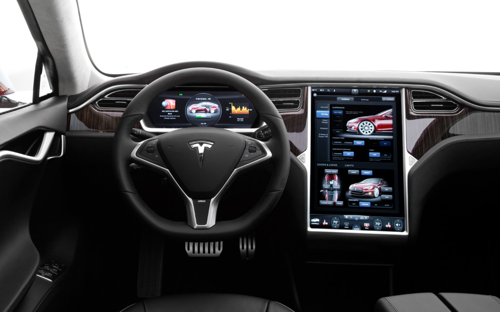
We are already well acquainted with navigation and entertainment screens in our cars, but how about your refrigerator and your toaster oven?
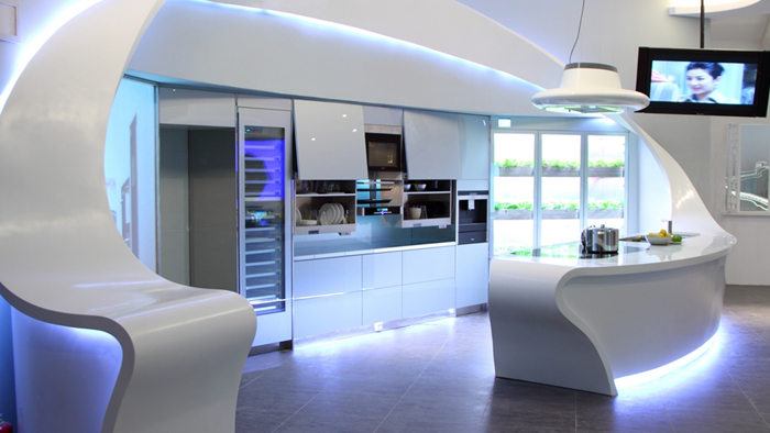
These cold war era visions of the “Kitchen of the Future” will probably not play out exactly as anticipated, but some form of their arrival does seem to be occurring even now.


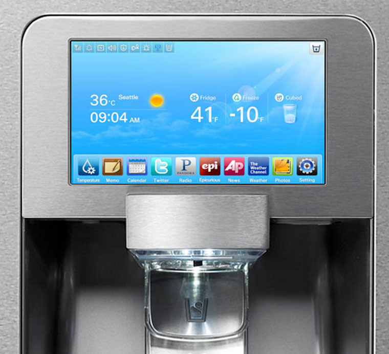
Will your website be optimized to display on the refrigerator door screen? Responsive design says yes, almost always, YES!
That is the beauty of responsively designed websites. Design once and display everywhere.
Not every screen will look exactly the same, but the presence of your content, brand, and products will come through no matter which device is being used.
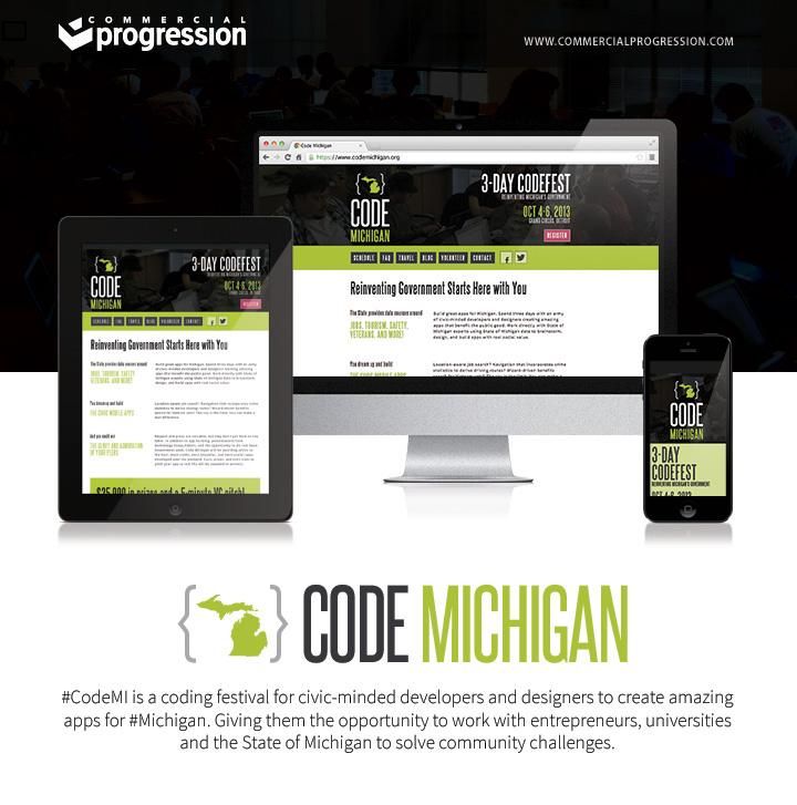
Take a tour through this gorgeous mockup Commercial Progression created for the Code Michigan Initiative. Every device accommodated beautifully with one responsive Drupal theme. Imagine your web presence receiving the same treatment.
Building mobile apps to show off the content of your website can create unnecessary and costly derivative web projects. Responsive design oftentimes answers the perplexing question, “Do I Need a Mobile App?” by nullifying it. If your website does everything your business needs, then a responsively designed website can be just as good as a mobile app. In fact, it can be even better in the sense that you now only have one destination to maintain. If your website is online and up to date, then everyone is getting the best experience.
If you are ready to get started on your responsive website project or upgrade, request a quote today and upgrade your business or organization to the most current web design standard.