Symmetri has joined Yes&.
We have some exciting news. Symmetri has decided to join the Yes& team to discover more possibilities to our clients.

We have some exciting news. Symmetri has decided to join the Yes& team to discover more possibilities to our clients.
 Posted by Brad Czerniak on January 15, 2014
Late last year I got an interesting email. It was an invitation to speak at the online precursor to the American Library Association's midwinter conference, predicated on my status as the first person to implement responsive design for a library website. This wasn't something I had really thought about, but I suppose it's true.
Anyhow, I thought it would be nice to share the slides and speaker notes from this presentation, in case anyone would like to reuse my drawings or find additional information about the topics I presented.
Thank you for the introduction, Laurie.
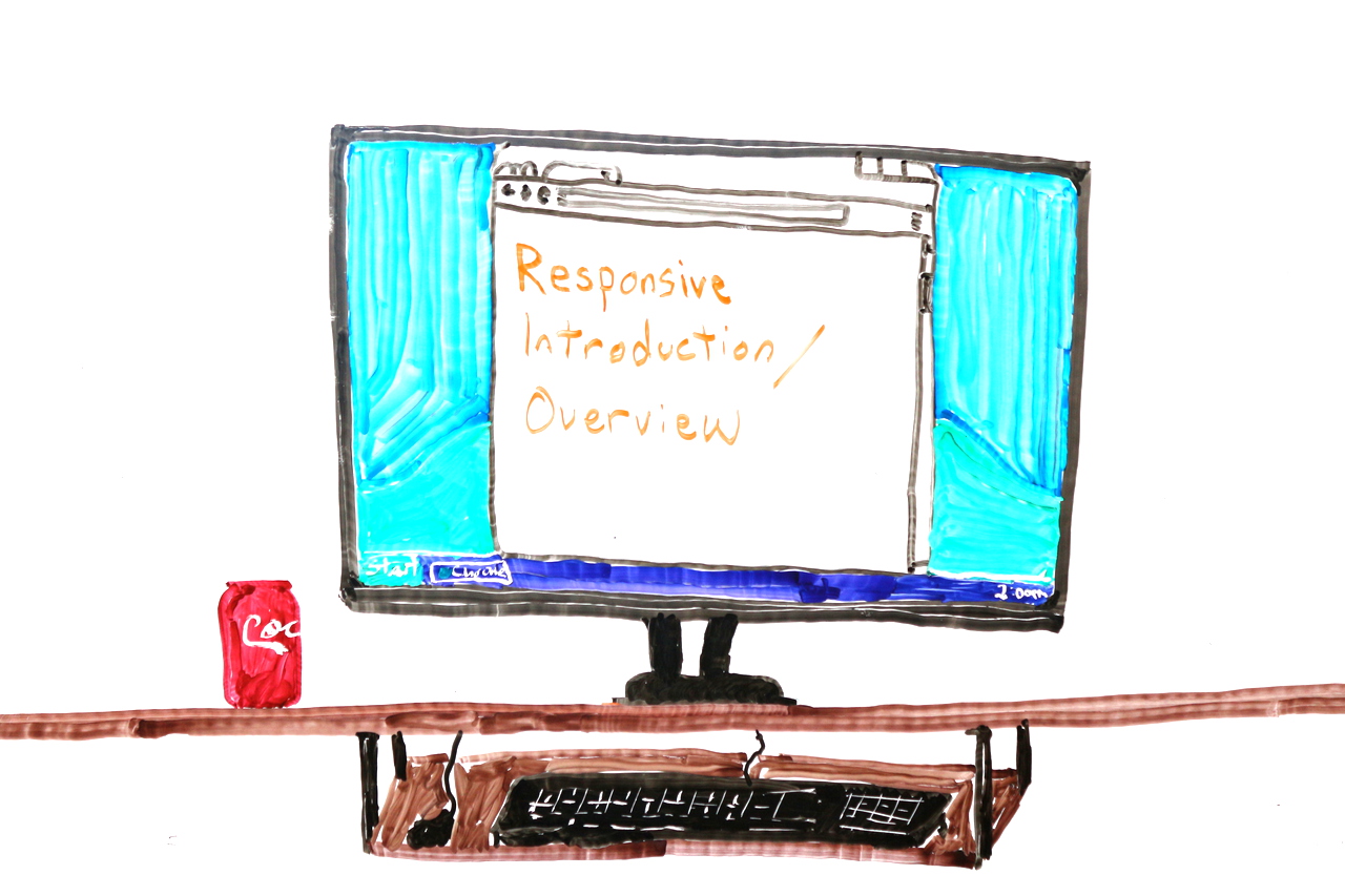
I’m taking this time to give you an introduction and overview of responsive design. Not the nitty-gritty of implementation, but more the context of how responsive design came about, where it is now, and to some extent where it’s going.

As mentioned, I'm Brad Czerniak. You can find me all over the web. I'm an MLIS graduate of Wayne State University in Detroit, and have spent the past few years as a web developer.

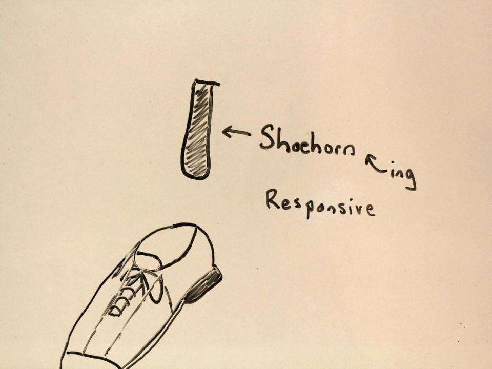
Previously I worked at Canton Public Library, which in late 2010 became the first library website to incorporate responsive design. We used the existing website and shoehorned in responsiveness (more on that later). After lots of browser testing, we soft-launched the style changes without any fanfare.
Last year I made a career change, left the library world (for the most part), and joined Commercial Progression.

We make excellent Drupal-based websites, many with responsive design out of the box, for clients ranging from National Geographic networks, the University of Michigan, TRW, to many others. We also support a number of libraries.
That's my plug. Back to regularly scheduled programming.

Let's do some quick time travel...
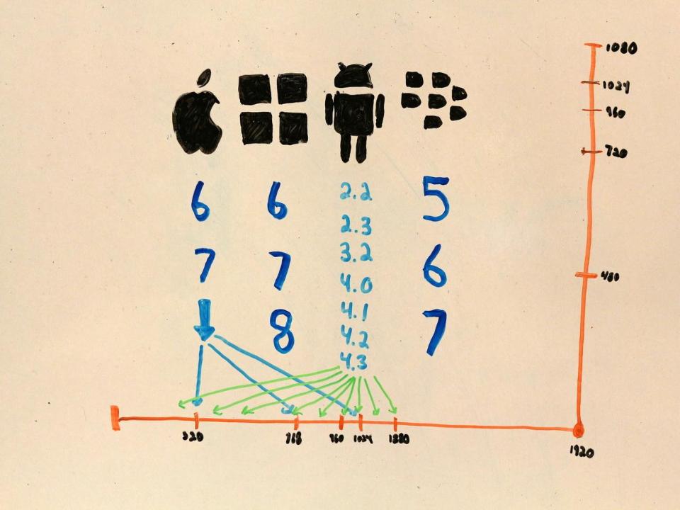
In the year 2007, Nancy Pelosi was elected Speaker of the House. George W. Bush was still in the White House, and nobody knew what the fox say.
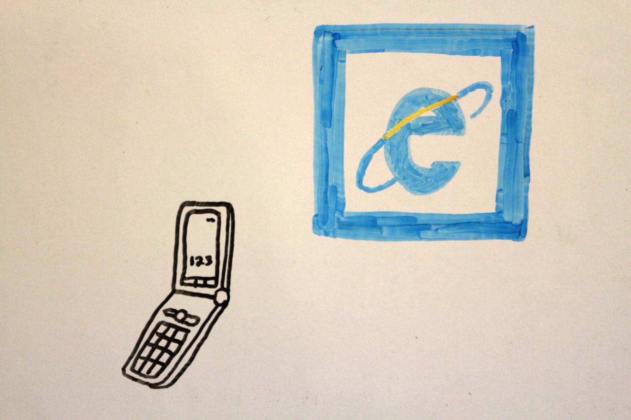
It was also a time, a time not all that long ago, when you probably had a flip phone and used Internet Explorer 6 at least some of the time. If you had a Blackberry, you were somebody important. If you used Mozilla Firefox (Google Chrome wouldn't come out for another year), you were part of an elite, nerdy minority.
Websites were made for desktop screens almost exclusively. Designers assumed the site would be viewed at 1024x768 or larger, on a screen 15" or more. Many website firms were still laying sites out using tables; a tactic invented in the 90s and made obsolete by 2003.
The first iPhone came out in 2007. It would be a year before Apple would introduce the App Store, so for a while the way to get information on an iPhone was by using the full-size web.
In some ways I really miss the simple days of 2007.

Let's fast forward a bit.
In the year 2010, the Supreme Court affirmed their belief that corporations are people, Toyota couldn't be stopped, and the bearded people who make duck calls did not yet have their own media empire.

It was also a time when you might see half the people around you clutching a smartphone, whether iPhone or Android. The iPad came out in 2010, so you would have started to see those too.
The mobile space was dominated by Apps. Even if all the app did was display the contents of your website, it was in your interest to make an app. Apps apps apps. And since developing an app involved real-deal programming and ideally some experience in the field, getting the attention of mobile users was an expensive proposition.
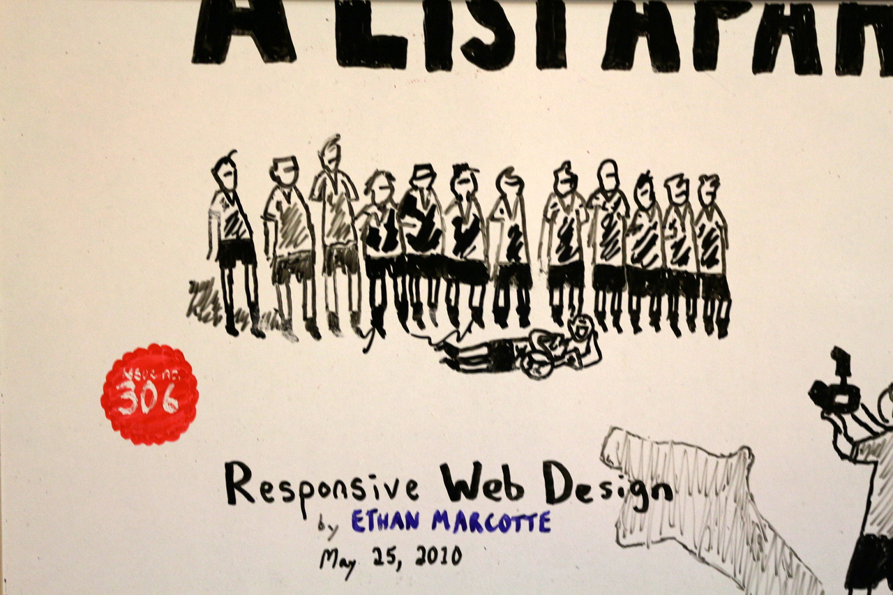
Luckily, all the chips were in place and a man by the name of Ethan Marcotte pointed it out to the world. Apple had made an easy way to tell their devices that a given web page should be scaled, Cascading Stylesheets had a number of new features that allowed elements to scale with the size of the screen, and all it took was some elbow grease to make a site that looked and worked correctly anywhere you viewed it.
I was instantly enamored with this idea. I had seen companies, people, libraries, create separate mobile sites to cater to the growing smartphone crowd. I had used an iPhone since 2008, and had been frustrated numerous times by links that redirected to the home page of some ill-considered mobile site. I had been burned by mobile sites that didn't have the content I needed, while the full-size site was blocked off from me.
The idea that you could develop a site one time and have it work everywhere, I was convinced, was the way forward. No separate URLs with m. or i. or something.mobi -- just a plain old website that worked nice on your phone.

Which brings us to 2014. Both 2012 and 2013 were touted as the "year of responsive design." Tons of sites took up that charge, and the mobile web is often pretty pleasant to browse.
The idea of creating an app is a lot less appealing now than ever in the past. In order to get a substantial amount of the market, you have to make at least an iOS and Android app, ensure it works across numerous versions and screen sizes, and hope that the stores accept it. It's expensive and not necessarily worthwhile.
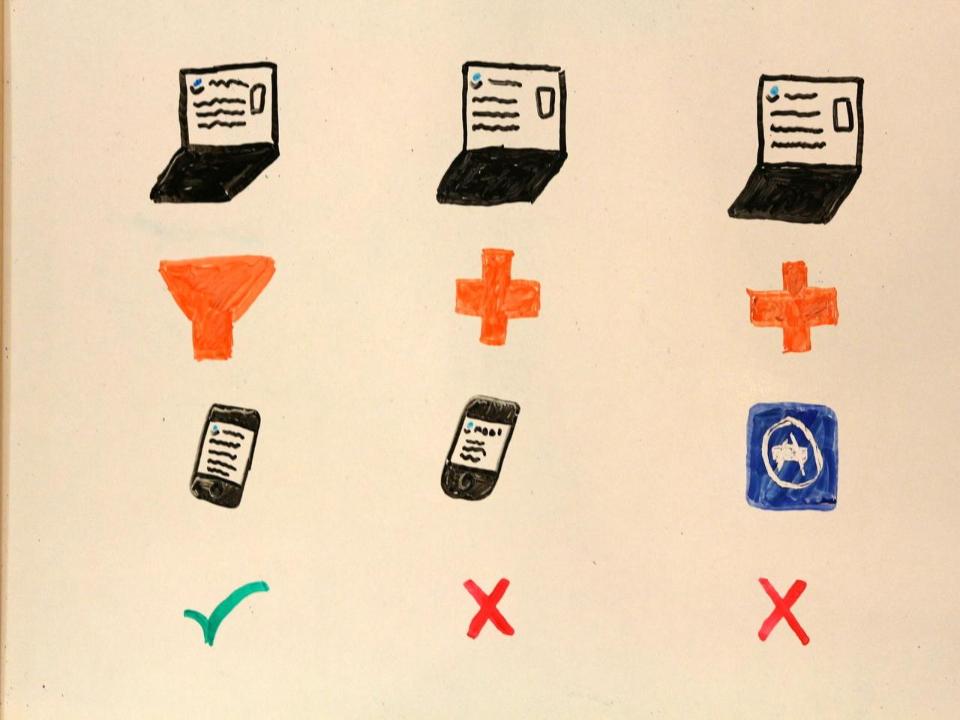
I can say with confidence that responsive design is the way to go. Creating a separate mobile site is bad practice. Creating an app has its own caveats. Responsive design is the most affordable solution, with the most benefits.
I don't want to delve too much into specifics, but did want to include this slide, because it took a lot of time to draw.
Needless to say, there are many ways to go about making a site responsive. There's adaptive design, full-fledged responsive, mobile-first responsive, etc. The designer and developer working in tandem can use a bunch of HTML, CSS, JavaScript, and even server-side techniques to drive the design just the way they intend.
One piece of potential good news is that, if your site was made with good, semantic HTML and doesn't use any over-complicated CSS, it's likely possible to have the site looking almost right on mobile devices sometime between an afternoon and a week. This assumes you have an idea of what you're doing in the site code, but that's the general idea of timing.
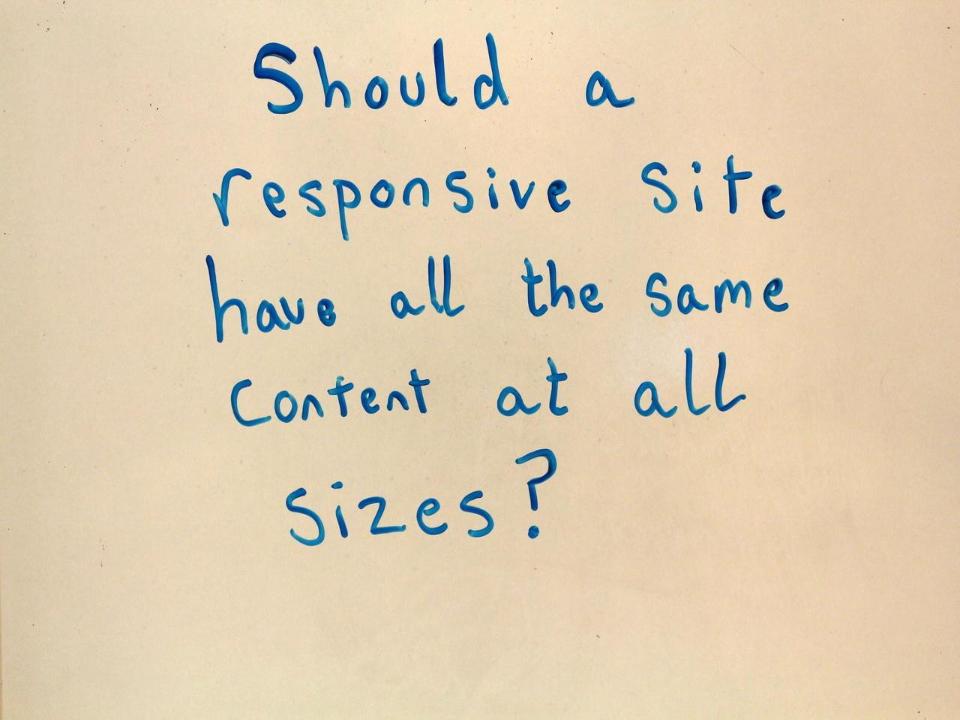
One question that I have a definite opinion on, but about which others disagree with me, is "Should a responsive site show all the same content on a phone-sized screen as on the full-size display of the site?" I say emphatically yes; users on mobile devices might be on the go and only looking for your address and hours. Then again, they might be at home on their couch, looking at your site for the same reasons they would on a laptop.

Now it's time for the buzzword lightning round. I'm going to talk fast now. Bear with me, and I'll stick around for Q&A if you want any more details.
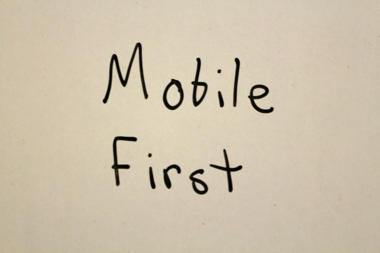
Mobile first is both a design method and a separate development method. The designer might start by designing the most basic concept of the site first, which is usually the branding/mood (AKA style tiles) and phone-sized view. The developer takes that design concept and writes the code so that progressively bigger screens get progressively more design sugar. One benefit is that smaller devices don't have to load as many images or interpret as much code.

This doesn't have to do with responsive design, per se. It's just a design trend that's been overused the past couple of years on the cutting edge, so it may find its way into the mainstream and be implemented badly fairly soon.

Rather than images that are stored as a bunch of pixels, SVG files store the image as a bunch of shapes. They can be scaled up without getting pixelated, can be recolored or otherwise modified in the browser using JavaScript and CSS, and are sometimes much smaller files than bitmap images.

A perennial favorite buzzword, HTML5 will continue to see widespread adoption, and the good bits involving forms and media will help developers everywhere create better mobile experiences.

Beware responsive images! There are a whole bunch of people who want to make images more complicated than they have to be for a whole bunch of not-so-great reasons. My argument against responsive images is much the same as the important question I talked about a few slides back.

Twitter (the company) made a framework of reusable styles that lets you make decent-but-cookie-cutter websites fairly quickly. There were others before it and new frameworks come out all the time. Some people like it, some people don't. It's a word you'll see a lot in design discussions, though.

The next cool thing in CSS. It lets you target browsers that specifically support a particular styling feature. The irony is that @supports isn't well-supported by browsers yet.

The CSS3 flex standard lets web developers implement layouts that used to be a lot trickier. Unfortunately, until all the major browsers support flexbox outright and a critical mass of users install those browsers, developers have to essentially pull double duty to make the cool layout and the backwards-compatible layout.
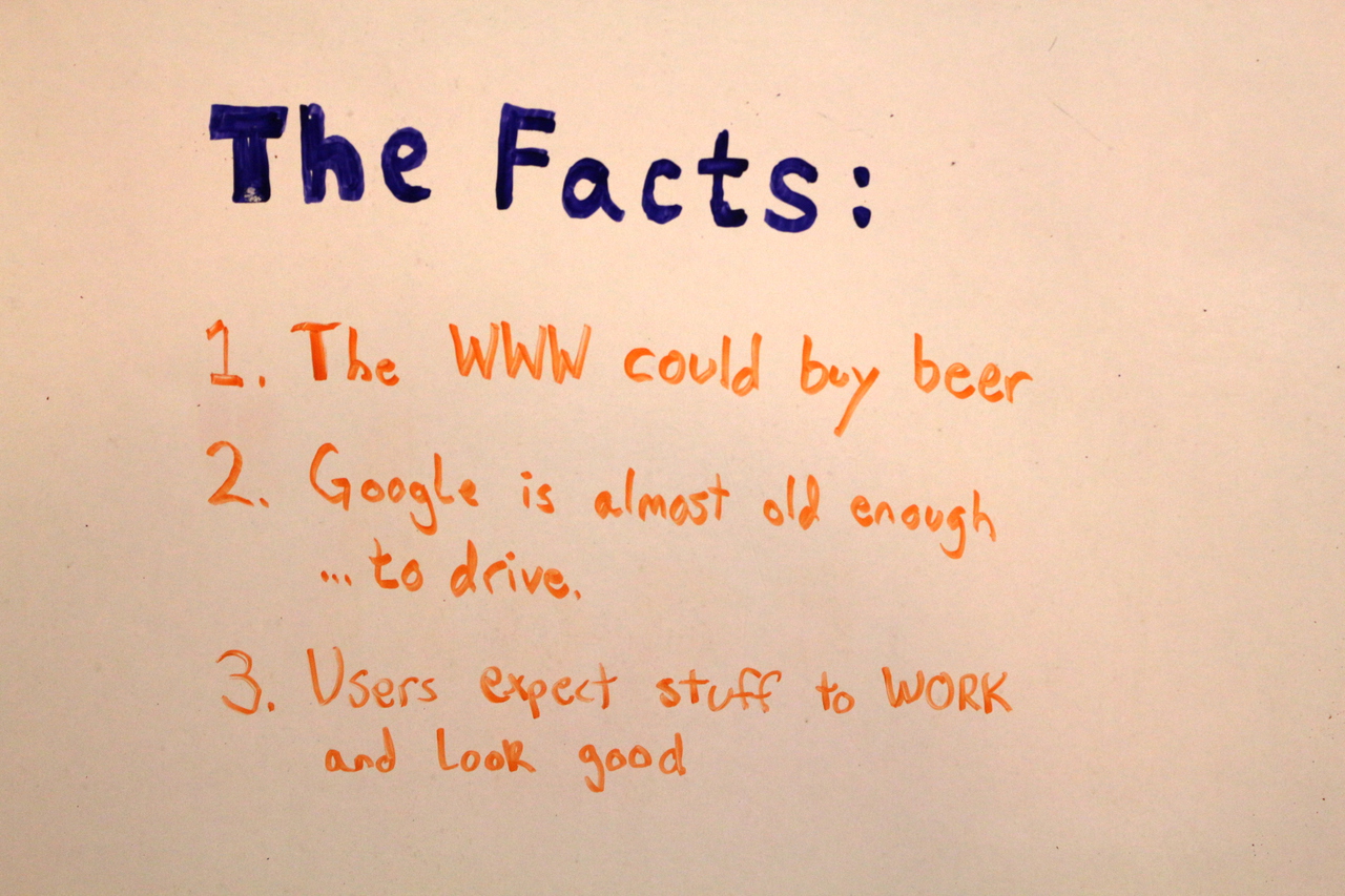
In all this discussion of the past, present, and near future, I thought I'd leave you with some facts to ponder.
It's wild to think how different the web was in just 2007, much less 1993.

Thanks!